Leadership & Development Spending (which is sometimes Marketing & Business Development Spending)

As a business owner, you need to grow revenue and build your network. As a manager, you need great opportunities to support leadership and development of your employees…

Conferences often support both of these causes, which is why many businesses spend 3-5% of total revenue attending or sponsoring events. Unfortunately, conference quality varies greatly. We have all been to the low-budget, low-value-added conference and felt like it was a waste of time. But, my goodness, when you find a GREAT conference where you can make lifelong friends and business partners… the value is unquantifiable!

The conference I’m most excited about this year is Story Camp (www.storycamp.com) *

Why? It’s small (like 50ish people) so you actually get to talk to the other attendees, it’s in a beautiful spot (Park City), it has top-tier speakers, and five-star accommodations/food. Their website puts it well:

Story Camp® 2025 is an intimate microconference designed to enhance your storytelling and presentation skills, scheduled for July 23-24, 2025, at the Pendry Park City in Park City, Utah. 

Event Highlights:

Dates: July 23-24, 2025

Venue: Pendry Park City

Duration: 3 nights and 2 days

What to Expect:

Workshops: Engage in three 90-minute interactive sessions led by industry experts:

Terry Szuplat, a former speechwriter for President Obama

Steven Franconeri, a psychology and design professor at Northwestern University

Amy Cuddy, a social psychologist and bestselling author

Personalized Feedback: Opportunity for select attendees to present and receive direct feedback from the experts

Skill Development: Participate in activities like the Abstract Accelerator and Pitch Peer Groups to refine your presentation abilities

Professional Assets: Receive professional headshots and on-stage candid photos to enhance your speaker portfolio

Networking: Connect with like-minded professionals in a collaborative environment

Recreation: Enjoy the amenities of the Pendry Hotel and explore the scenic beauty of Park City during the summer

This program is ideal for professionals aiming to improve their communication skills, whether for customer interactions, investor pitches, or internal presentations. The emphasis on storytelling, visual design, and stage presence ensures a comprehensive enhancement of your presentation capabilities.

*I like it so much that I purchased a piece of the company

The Ideal Compensation Plan

All business owners are struggling to create the ideal way to retain their top performers. As a CFO, it pains me to see companies try to “show their employees the love” and miss the mark. The perfect compensation plan varies by employee, but there are common mistakes that are easily fixed by the framework described below. Like it or not, your incentive plan becomes part of your company’s identity, and your employees will behave rationally based on the incentives that are provided to them.

“Show me the incentive and I will show you the outcome”
— Charlie Munger

After many years of obsessing over this problem, I’ve finally found a framework that works for the large majority of companies and employees… and that is a big deal because if you get this right, your company will be more profitable, your employees will be more engaged, and your stress levels will be reduced.

I believe the structure outlined below is the best way to create incentives for your employees which will lead to improved retention and growth. However, the structure only works if your business is profitable and built on a solid foundation (if you have problems there, I can fix them).

First, let’s fix two common compensation problems. Don’t provide all your pay adjustments at one point in the calendar year. The hedonic treadmill created by the human brain is a challenge for everyone, don’t group three separate events (annual raise, bonus, and profit sharing) into one event just because it’s easier on your finance team. Doing so makes your employees feel really good for about three weeks and then underwhelmed by their compensation for the other 49. Second, understand that the financial information can’t always be an open book. Many resources suggest incentive plans based on entirely open books, like Profit Works by Alex Freytag and Tom Bouwer. That is a deal breaker for the majority of SMBs in this country, often because the owner’s personal finances are strongly entangled with the business’ finances. Too much transparency leads to one of two reactions: “I’m getting fired” (in bad times) or “I’m getting screwed” (in good times). Those reactions are understandable, it’s likely that less than 1% of your employees have ever managed the finances of a business this size (they don’t understand taxes, recessions, clients not paying their bills, overstaffing, having personal debt backing the business, etc.). It’s almost not fair to expect them to interpret the business finances correctly… most businesses shouldn’t do it.

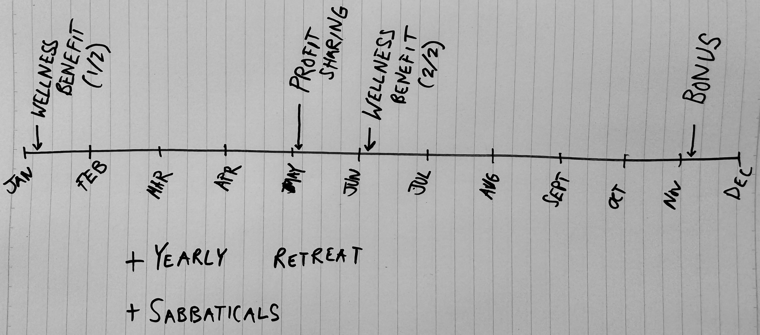
The ideal compensation plan includes four or five times each year where your employees get extra compensation, to consistently show your appreciation for their hard work. The timeline above is hand-drawn by design, this is the hundredth iteration...  

So, back to the ideal incentive plan. It should look something like this:

  • Fair Salaries

  • Wellness Benefits

  • Regular Pay Increases

  • Annual Bonuses

  • True Profit Sharing

  • Yearly Retreats

  • Sabbaticals

This structure provides a thoughtful solution to employees who value different incentives. Three of the six incentives aren’t directly tied to cash. A wellness benefit provides funds to grab a gym membership, retreats allow for times to build in-person connections, and sabbaticals allow your team to unplug from the job and recharge (an example sabbatical structure might allow for a five-week sabbatical after five years of employment and would cost your company about 1.5% of revenue).

The direct monetary benefits allow your employees to keep up with increasing costs (regular pay increases), share the company’s wins (true profit sharing, sharing a % of net income after-tax), and bonuses (a portion of pay that is saved by the company to make your staff feel loved at the appropriate time of year).

Lastly, you should plan the timing of those benefits in a way that makes it clear that you love and appreciate their work year-round (this will vary by company but likely will look something like the sketch above).

Ownership

Business owners have a unique perspective on what it means to own and operate a business (they are the only people who truly understand the ups and downs). Owners also uniquely understand business risks. If you have ever skipped a paycheck to make sure your employees get paid or used your house as collateral for your business you know what I mean.

Yet, even if you don’t own a business, understanding the advantages and disadvantages of business ownership is important. First, anyone can own a piece of a business by buying stock in a publicly traded company; and most people should own equities. Why? In well-functioning capitalist societies business ownership outperforms wage growth… and of course, it should. Business owners take all the risk (remember who risked their house in the previous example), and they have to get rewarded for that.

The graph below “The worker vs. the owners” articulates this point. In times of economic growth, business ownership (shown here by the index performance of the S&P500) significantly outperforms wage growth.

When people see a graph like this there are two common reactions:

  1. I understand the power of business ownership in wealth creation. Even if I don’t own a piece of the business I work for, I’m going to invest in equities to help my wealth grow faster than my wages. But also, business ownership seems extremely volatile AND what happens in the recessions (which conveniently aren’t shown here)???

  2. The black lines go up. Leverage!

If you know me well, you know I believe the first take is the most reasonable one. Business ownership can be life-changing for wealth creation but it has enough ups and downs on the operating side… you don’t need to magnify the financial ups and downs with leverage. And what about those recessions? Those are the things that will wipe you out completely if you don’t have a strong balance sheet. Of course, the author of the chart left those off… because showing economic downturns where business wealth declines more quickly than wages makes this conversation more complex.

Using Client Profitability & Cash Management to Increase Margins

If your business has consistent cash flow challenges the likely cause is a profitability issue in disguise (meaning that you aren’t profitable enough to cover the expenses required to run your business)… but today I want to talk about businesses that "have it all figured out” and are consistently profitable (after all, good businesses are consistently profitable).

Let’s use an agency that does 7 million in annual revenue, as our example. The leadership team is seasoned and has the right industry connections. Last year, they had an operating margin of 19% ($1,330,000) but they feel stagnate and they have never had margins greater than 20%.

How do they move from 19% margins to 25% margins?

  1. Understand and optimize client profitability (adds 3-6% margin)

  2. Cash Management (adds 0.5 - 1.5% margin)

If you have a clear understanding of client profitability… you can drive the business toward the most profitable clients and tasks (and away from the opportunities where you don’t have healthy margins). I call this a sweet spot analysis. For profitable businesses, this can increase operating margin by 3-6% (and it can have an even more dramatic effect on struggling businesses).

The example below shows the profitability of the top ten clients for our example agency. Using the column on the far right (Operating Margin) it becomes immediately obvious which clients present a profitability challenge. Now you can go fix it (I’m not implying that this is easy) and take a huge step to increasing your margins. As an aside, I will remind you that the most profitable agencies are the ones who occasionally fire clients (and while I’m not saying that is the right option here, it does have to be one tool available to you).

Example of a client profitability analysis for an agency

The last point on improving margins relates to being smart with your cash on hand. Digital services businesses like the agency above should keep 10-30% of annual revenue in cash (as part of the tax provision, business savings, bonus pool, etc.). If you manage that cash wisely it can lead to another 1% increase in operating margin. This can be implemented in many ways from a super simple process to a complex process involving a treasury management team (or software), but the point is: don’t leave this “free money” behind.

Investing returns are the least important thing

Most investors measure themselves against two things: the market and their peers. Most investors are doing it wrong.

The true goal is to save the most money, not the have the best returns. Now, most people think that making the best returns actually creates the most money… they are wrong. The best returns leading to the most money is only true when you invest a lump sum, don’t take money in or out and wait… in life (or business) this basically never happens (you buy a new car, a house, have kids, start a business, etc).

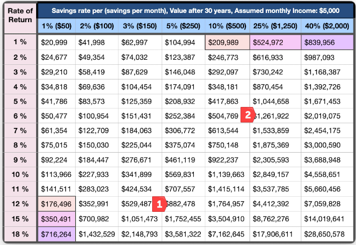
Hopefully, you get the point by now, the person who saves 15% of their income and makes a 5% return will be a lot better off than the person who saves 1% of their income and makes a 15% return. But the investment and financial management professions (along with most investing “news” organizations) get this wrong, they talk about returns rather than a holistic financial picture… and that gives the perception that we should focus on returns. That’s incorrect.

Rene Sellmann (@ReneSellmann) articulates this nicely in the table below. Many people seem to target Point 1 (Saving 5% and planning on a 12% return) rather than Point 2 (Saving 25% and planning on a 6% return). A 12% return over 30 years is challenging and will always be unlikely for someone who isn’t Seth Klarman (and you aren’t), but also, a 5% savings rate means you spend 95% of your income and that means your financial “needs” in retirement are much greater than the person who only spends 75% of their income (the 25% saver in the example below). Increasing your savings rate gives you a bigger nest egg but it also decreases the size of the nest egg you actually need, it’s the super drug of future wealth.

How you save matters much more than your investing returns. We have to ask ourselves if we can change the way we think about investing/savings to painlessly increase our total savings amounts. And the great news is that we can!

American’s largest asset (on average) is their home equity. Do you think that is because real estate is the best-performing investment asset… nope. It’s mostly because of the “forced savings” aspect of a mortgage. People pay their mortgage first and typically pay their mortgage mindlessly (without thought). The lessons from a mortgage teach us a lot about what type of investments can increase our savings rates. They typically have:

  1. First priority for the use of available funds (mortgage, 401k, automated long-term savings plan)

  2. Paid without thought (or automated)

  3. Simple - an investment that can be made without analysis (a tried-and-true investment that you believe in)

  4. A “lock up” period - the funds are hard to get to when you find something new that you “need”

To prove this is true let’s think about the inverse. You have $5000 that you don’t need for anything and you want to invest. You have your eye on some NVDA stock because Jim Cramer won’t shut up about it but you also want a new computer and some new shoes. In that scenario, there is probably an 80% chance that you make a bad bet on an individual stock or blow the money on new toys and only a 20% chance that your “investment” turns into a solid asset in 5 years’ time. That approach to investing rarely increases your savings rate consistently - it’s a problem. Yet you might tell yourself to do it because you are “increasing your investing returns” by spending more time thinking through your investing approach… don’t do that. Make investments using the framework above and move on.

Meb Faber looked at this challenge from a different lens but still came to the same conclusion. He wondered “How much alpha (investing outperformance) do you HAVE to generate to break even on the time spent to achieve it?” He breaks that down in the table below.

The columns on the far right (highlighted in yellow) tell the story here. If your portfolio is worth $500,000 and you make $100,000 per year, you need to outperform the market by 4% per year to make your time invested worthwhile (Meb assumes you spend 8 hours per week on investing research), do you know how hard it is to outperform the market by 4% for one year? Let alone year after year?

There is a clear takeaway here: Use the principles above to get your portfolio value north of 5 million and then we can talk about investing returns.

What are a few simple ways to use the principles above? (note: I don’t care what you use to improve your savings rate, but the following work for me)

  • Use Wealthfront to automate your savings (which uses principles 1, 2, and 3 above)

  • Use Arrived Homes to buy a piece of single-family rental properties (using principles 3 and 4 above because your investment is illiquid - the typical holding period of each home is 5-7 years)

Obviously, this isn’t investment advice. I don’t expect either of the investment options above to “outperform,” but hopefully you know by now that outperformance doesn’t lead to the biggest pile of money down the road - that requires the best combination of savings rates and investing performance.

Do Data, Better Webinar (On Demand)

We got great feedback on this webinar. Check out the video link and reference materials below… A special thanks to Ghostranch for organizing!

Largest Vocabulary in Hip Hop - this site has some incredible pop culture-related DataViz!

An Intro to Income Statements, Balance Sheets & Cash Flow Statements

What is the most confusing thing for small business owners? For many, it is these important (but confusing) reports from your accounting software: the Income Statement, the Balance Sheet & the Cash Flow Statement.

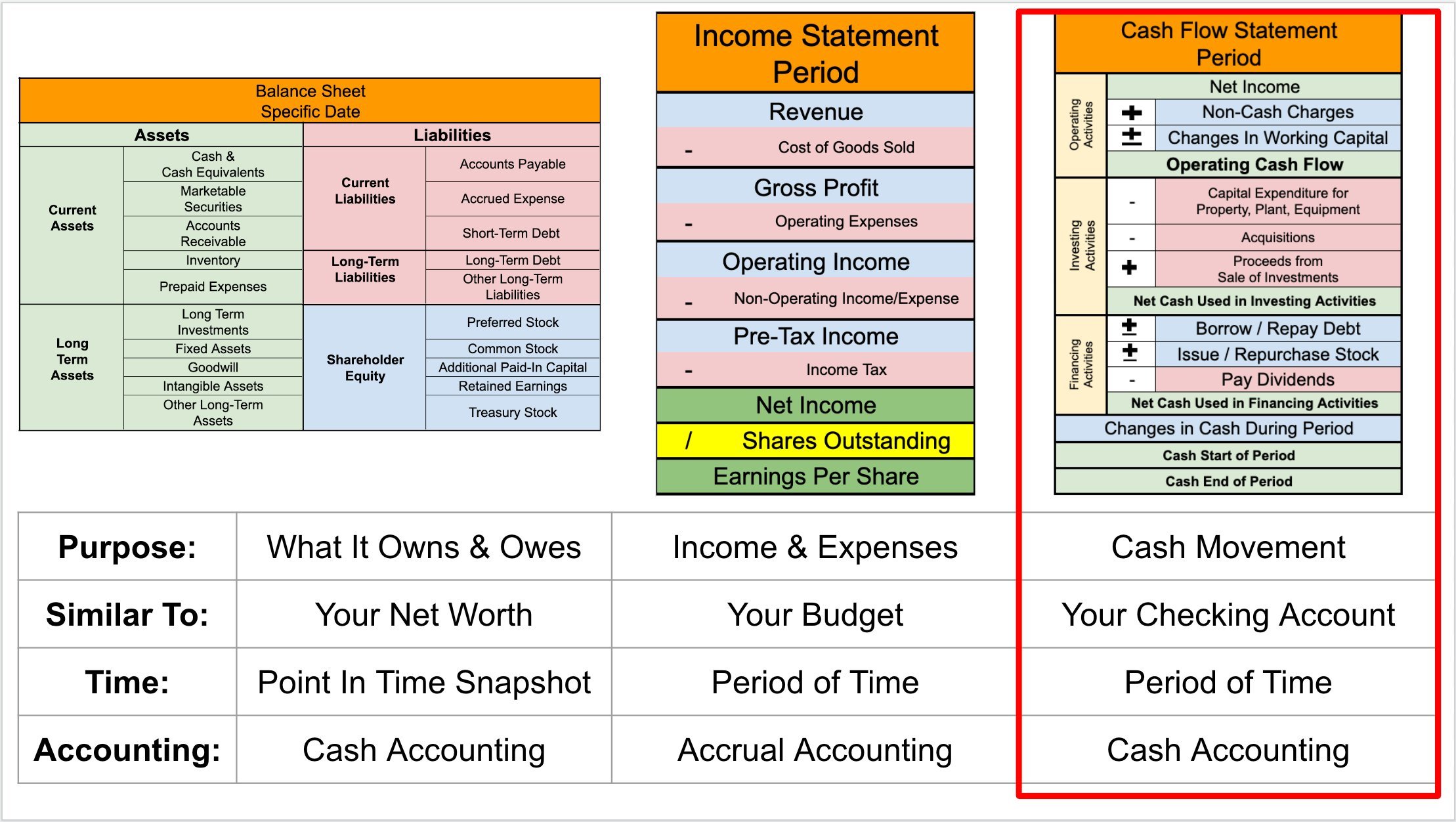
Brian Feroldi (@BrianFeroldi) has built the best (and possibly the simplest) visual guide I’ve seen. Let’s start small and work on getting a basic understating of each report.

High-level summary of accounting statements from Brian Feroldi. The Cash Flow Statement is highlighted because it’s the most important (but unfortunately, not the most popular).

The most popular financial statement is the Income Statement (which is also called the Profit & Loss Statement). The Income Statement shows your business’s income and expenses over a period of time using accrual accounting.

The Balance Sheet is a summary of what your business owns (assets) and owes (liabilities) at a point in time. It uses cash accounting.

Lastly, the Cash Flow Statement shows the moment of cash over a period of time using cash accounting.

Business owners quickly figure out the difference between the Income Statement and Cash Flow Statement when their bank balances aren’t aligned with their “net income” figures. If I’m making all this profit why don’t I have any cash?

The Income Statement (also called the Profit and Loss Statement “P & L”)

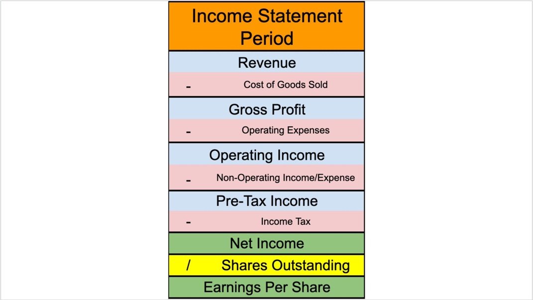
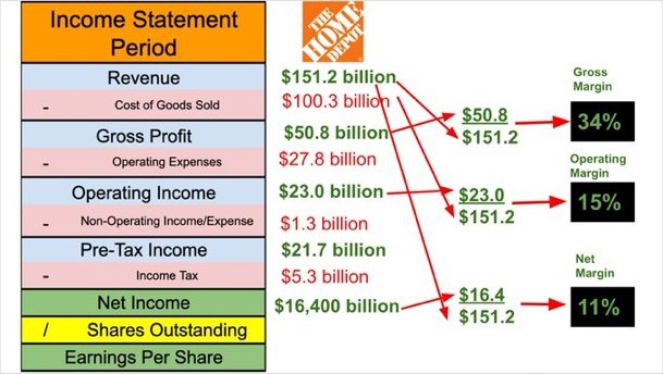
At its core, that Income Statement is trying to show how your company makes money (Net Income) and how your expenses are distributed. The simplest Income Statements will have the following structure (again, I’m using visuals from Brian Feroldi).

The top of this table will always be “Net Revenue” (Total Sales) during the period shown. When folks say “top line revenue” they truly mean the revenue from the top line of your Income Statement. As we move down the Income Statement we subtract expense by expense until we get to Net Income.

The first expense is the Cost of Good Sold (also called the Cost of Sales). The “Cost of goods sold (COGS) refers to the direct costs of producing the goods sold by a company.” As such manufacturing companies will usually have a much higher COGS than service companies.

  • Revenue - Cost of Goods Sold = Gross Profit

Gross Profit (also called Gross Income) is the total profit after accounting for the direct costs of selling the goods your business makes, but calling it profit seems misleading because there are still a bunch of very real expenses that your business has to cover.

  • Gross Profit - Operating Expenses = Operating Income

Operating Expenses are the total expenses required to operate your business (sometimes these are spilt out into categories including selling, general and administrative expenses, research and development expenses, depreciation and amortization, etc). When Operating Expenses are removed from Gross Profit, you have Operating Income (sometimes called EBIT = Earnings Before Interest and Taxes).

  • Operating Income - Non-Operating Income = Pre-Tax Income

Non-Operating Income is most commonly interest that you pay to someone else or interest that is paid to you (investment income is also recorded here). For most small businesses the difference between Operating Income and Pre-Tax Income is small. A good CFO can significantly enhance Non-Operating Income! Pre-Tax income is also called Earnings Before Tax.

Normalizing your financial metrics helps benchmark your business against your peers. The most common

The Balance Sheet

Half the confusion about these financial statements seems to tie back to understanding the time periods shown. The Balance Sheet shows financials at a point in time (example: December 31, 2023). This defers from the Income Statement and Cash Flow Statements which show financials over a period of time (example: January 1, 2023 - December 31, 2023).

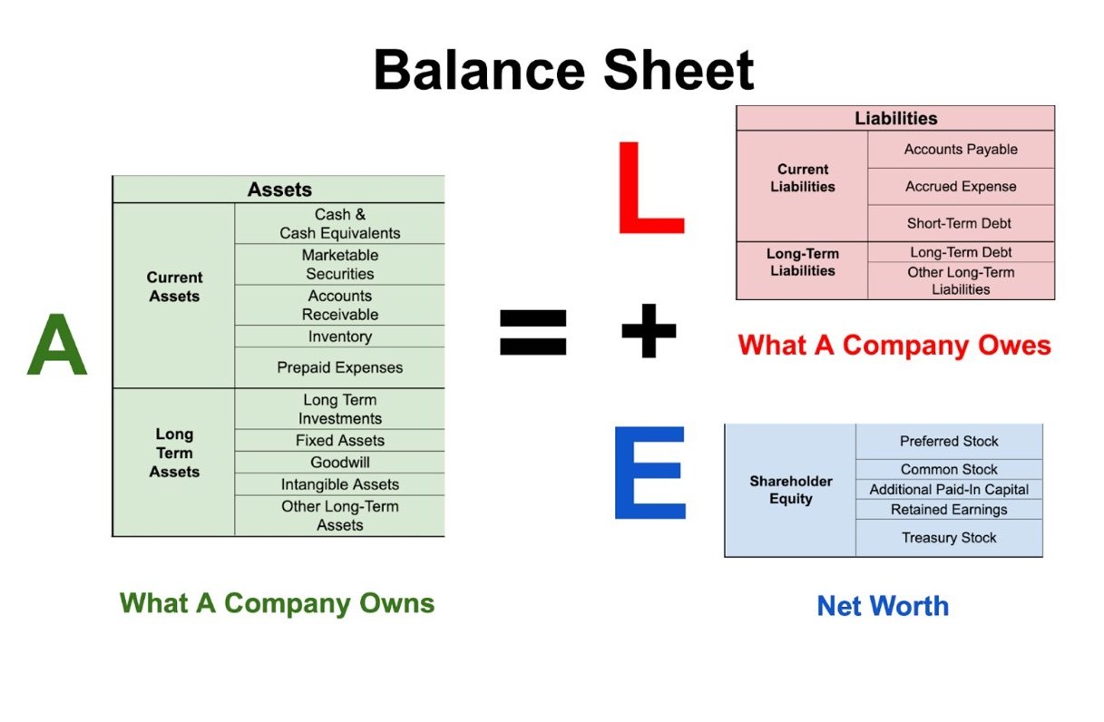
The balance sheet is built on one central equation: Assets = Liabilities + Shareholder Equity. For some people, it’s easier to think of the equation like this: Assets - Liabilities = Shareholder Equity… because if I have $100 but I owe a friend $10 my ‘net worth’ is $90 ($100-$10=$90). In “balance sheet speak” your net worth is your shareholder equity. This formula must be in balance at all times, so anytime your business has a change in assets or liabilities the balance sheet is impacted.

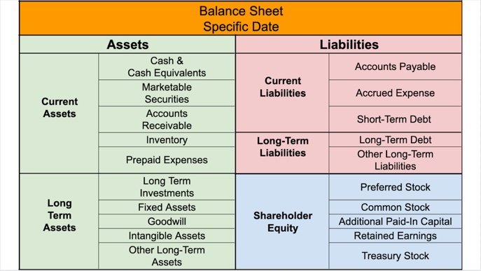
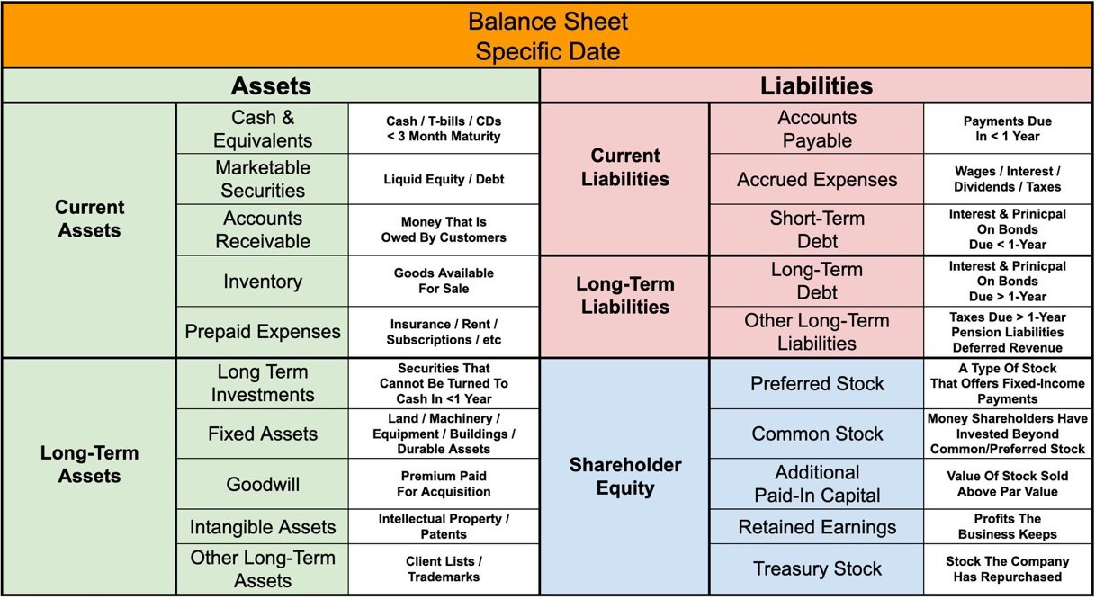
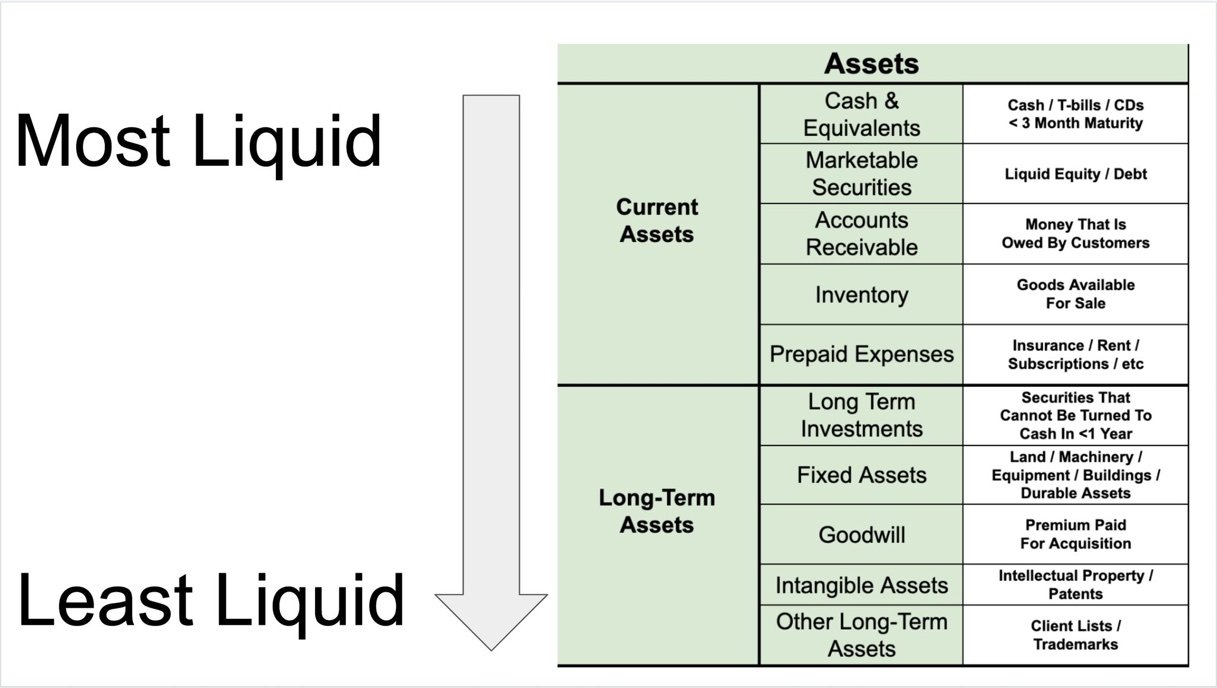
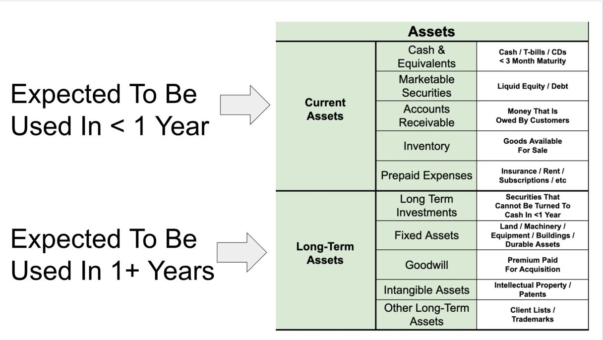
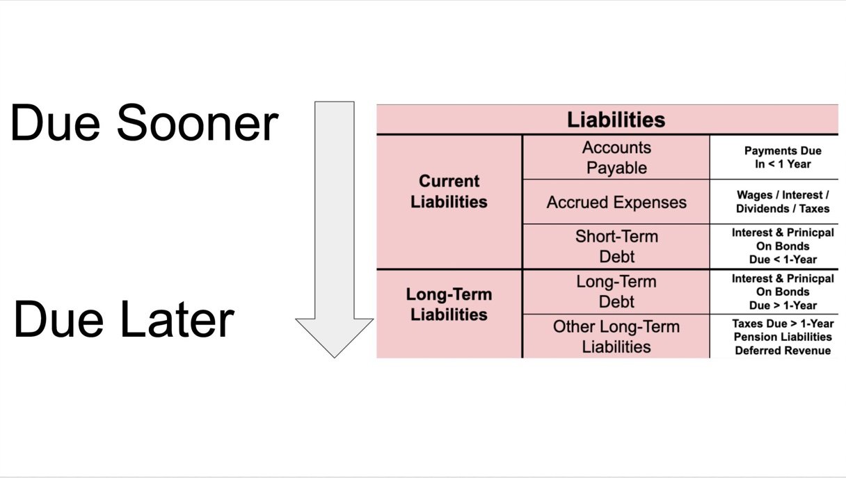
What type of assets and liabilities goes where? Brian’s graphics below will give you examples.

Current assets are assets that are expected to be used in the next 12 months.

Long-term assets are expected to be used for more than 12 months (Buildings, Equipment, Trademarks, Patents, etc.)

Liabilities use the same methodology. Current liabilities are due in less than 12 months and Long-term liabilities are due in more than 12 months.

One great “shortcut” to identify a company’s near-term financial position is the Current Ratio. The Current Ratio = Current Assets / Current Liabilities. A Current Ratio of less than 1 is a challenge… the company has more liabilities than current assets and will likely struggle to pay the bills. But a current ratio of 2 or more? That company has more than double the amount of short-term assets than is required to bill their bills. They are in good shape!

Lastly, Shareholders Equity. For many small to medium-sized businesses stock isn’t formally allocated (or at least not publicly traded) so the Shareholders Equity section is simpler than what is shown below. Think of this simply as the net worth of the company, which in the simplest sense is equal to the amount of retained earnings held by the business.

The Cash Flow Statement

Coming soon!

Why visual financial statements are important

Remember how in elementary school the teachers frequently talked about kids in the class having different learning styles? Multiple studies show that more than 60% of the population are visual learners… and common sense tells us that very few people easily consume endless lines of numbers in a table. The numbers blend together. They are often shown in unfamiliar units (i.e. in thousands or in millions). Yet finance and accounting professionals frequently produce endless tables of numbers and expect them to “tell a story.”

Below I’ve included Nike’s Income Statement from their most recent 10k (yes it’s really that small).

Source one, and source two

An unedited Income Statement for Nike. Pulled directly from the company’s 10k.

Let’s compare the Income Statement above to a "Visual Financial Statement,” I created. The expenses are shown in light blue and are “costs to the business” (for example Total Revenue minus Cost of Revenue equals Gross Profit). Is the Visual Financial Statement perfect? No. Does it need to be supplemented with more detailed financial data for those who want to go deep in the weeds? Yes. But for the large majority of people, this tells a story that they can’t get from the table above. Trends are easier to identify, comparisons are easier, and the true nature of how money flows from Revenue to Net Income is more clear.

A “Visual Financial Statement” for Nike. Light blue bars are expenses.

I’m arguing that many finance professionals need to do better. My clients get Visual Financial Statements regularly. Not just to understand their Profit & Loss but also for Cash Flows, and other key metrics.

I’ll make my final point by stepping out of the world of finance and into the work of statistics. The following four datasets (know as Anscombe's quartet) have the same descriptive statistics (things like the mean, median, and variance). If we looked at summary statistics of the datasets we would be misled (because those metrics would imply that these datasets are the same). So, let’s use a visual representation of the data instead (if you imagine these datasets are financial metrics of a company, it’s easy to see how important the visuals become).

Big News!

I’m excited to announce that I have officially launched a financial strategies firm focused on helping small businesses better manage their finances (i.e. optimize profitability, manage cash flows, plan & budget, complete a business valuation, create an exit strategy, etc).

Now I know that not everyone reading this owns a small business, but imagine that you do…

What if I told you that you could have a long-term strategic partner to handle all of your finance questions with ease… so you could focus on better (and more interesting) things?

…And what if you could bring that partner into your business for a fraction of the cost of a full-time CFO?

If you know me well, I’d ask you to keep me in mind the next time you or a friend of yours mentions a financial challenge that they haven’t been able to solve (inflation, employee retention, etc). Please always feel free to grab some time with me to discuss (using this link).

There is additional information about the business and what makes my firm different from the average competitor, here:

Most importantly, What can you do for my Business?

Every business is different and all my solutions are tailored specifically to the needs of your business, but the lowest hanging fruit is typically in the following areas:

  1. Adding intelligent cash management (this is an easy way to make tens of thousands of dollars per year) and most small businesses don’t even know about it

  2. Improving profit margins (by thoughtfully reducing expenses and targeting high margin opportunities)

  3. Reducing financial stress (regular one-on-one meetings to take the headache out of managing your business finances)

Zooming Out (a different view of investing performance)

One’s perspective in life is important, and so are one’s expectations. Some say “life is about expectations” meaning if your expectations are too high you are bound to be disappointed and if your expectations are reasonable you might end up pleasantly surprised. What are your investing expectations? Do you want to beat the market? If so, over what time period (one month, one year, 10 years)?

I like to tell stories with the benefit of hindsight, so let’s start by comparing a portfolio’s performance to the S&P 500. I doubt one would be happy about this period (assuming you expect to beat the market on a yearly basis).

Select Years MCM.png

Returns

A “zoomed-in” view of performance vs. S&P 500 for select years since 2012.

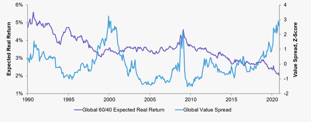
The following portfolio has underperformed in six of the seven years selected. This portfolio sucks, right? It may… but let’s zoom-out (which will help us change our perspective). Below is the entire performance for 11 years from Jan. 2010 through Dec. 2020.

2010 - 2020 vs benchmark.png

The ‘zoomed-out” view seems a little better, but man, there is still a lot red… I’m not sure that I like the idea of holding this portfolio. There are a lot of ups and downs and two periods (2012 - 2014 and 2017 - 2020) of underperformance. How do you think this portfolio performs for the entire 11 years? Let’s zoom-out again!

Screen Shot 2021-07-09 at 4.23.40 PM.png

Finally, we get the complete view. The light blue portfolio has significantly outperformed the benchmark over the full period (despite underperforming on a yearly basis six out of 11 years). The light blue portfolio has averaged roughly 17% annual returns! The light blue portfolio has turned $10k into roughly $61k in 11 years… but the light blue portfolio only felt “fun” or “easy” in two of 11 years (2010 and 2016) less than 20% of the time.

At this point, you have probably guessed that the light blue portfolio is my portfolio (it’s not fair to pick on anyone else’s portfolio). When I “zoom-out” it feels like a pretty solid track record, but for most people, I think the performance above is a rare form of torture - especially in 2014 and 2020. Welcome to value investing friends!